[toc]
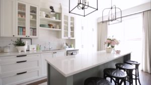
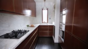
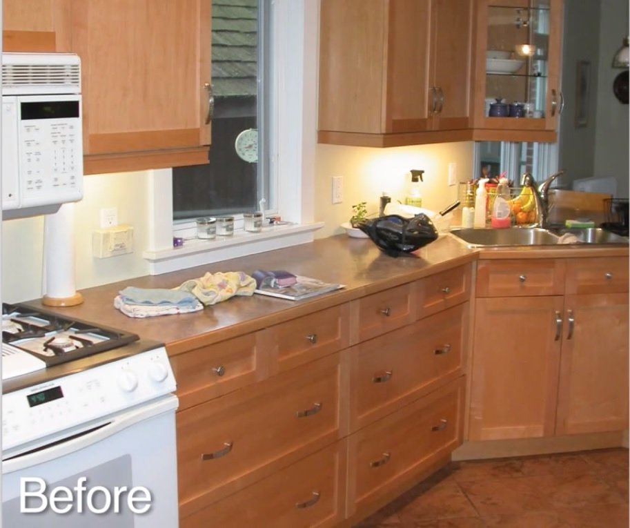
This is a fun family kitchen decor renovation that we did. When a client came to me, she presented me with this kitchen remodel that was a little out of date. It was a lot of wood, on wood, & on wood. The kitchen itself actually functioned but it was a bit tight. It really was in need of an upgrade.

Designer Sarah makes the most of an outdated galley kitchen. Learn how tricks, like removing upper cabinets and adding open shelving, can make a kitchen seem larger.
Kitchen Decor
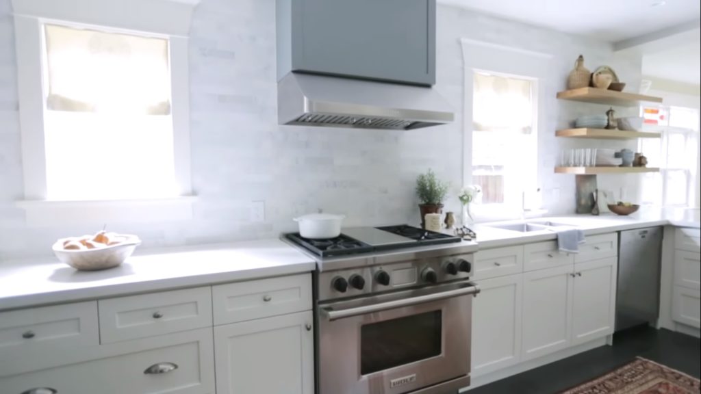
Something that was really great about this kitchen decor to start with is, that this whole length of cabinetry here is up against the south wall. There are two big windows on it. You wouldn’t have known that in the old kitchen, because of the dark uppers and the fact that there were so many uppers coming off the wall. It was blocking a lot of that natural light. So first and foremost, I really wanted to open up that elevation. By keeping as little uppers on there as possible, it really left the light filter through space.
Closed and Open Shelves
I did have to convince the client to go with open shelving for the kitchen decor because there is always that debate of the closed and open shelves. But it’s such a busy kitchen, we’ve got cups and plates flying off the shelves, so it’s actually very functional for her. There is a lot of closed storage for the things that are a little less pretty to have out. So by taking those uppers, I needed to find easy storage solutions somewhere else in the space. So I reoriented the peninsula to add more storage in there.
Kitchen Cabinetry
When it came to this style in the color of the kitchen pantry cabinet, a white shaker style we knew it was going to be timeless. So we wanted to go that way. But to sort of make it a little more unique, we brought in this great charcoal gray color. It really turns that pantry in the back into furniture looking piece. Furthermore, we also decided to take that same color in the kitchen decor and use it over the hood just to add a little bit more interest on that light wall.
Countertop and Backsplash
For the countertop, I went with quartz. It’s so hard wearing because she cooks so much and because there are four teenagers that are a little bit rough on the kitchen. It was just the right choice to go with that. It kept it nice and light. For the backsplash, I went with an oriental white subway tile, a 2×8 inch format in a brick lay. It just sorts of is a nod to the more traditional materials but in a more contemporary way by pulling it all the way up to the ceiling.
Fridge and Flooring
In planning kitchen decor, I repositioned the fridge up against the north wall. One of the main reasons that I wanted to move the fridge is that it’s the one sight line that you have from the back of the house and you’re now looking at a nice millwork piece as opposed to an appliance. By moving the fridge over to that wall, beside it, I created this little draw fall area with the microwave above and the recycling center below.
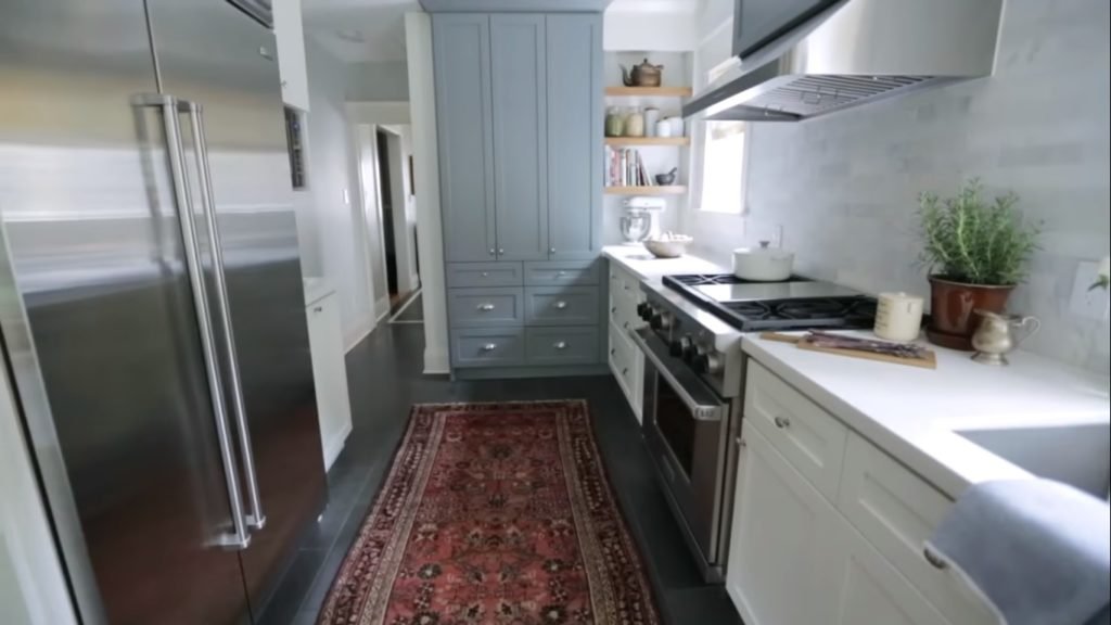
For the flooring, I used a blue stone material and it’s in a 1 foot by 2-foot brick lay. It’s a more traditional way of laying the stone. The kitchen really is a more transitional design.
Modern Kitchen Decor
One of my favorite things about this renovation is even I was shocked at how bright the luxury kitchen design actually looked afterward. I knew that by getting rid of all that wood, it was definitely gonna lighten it up. I also love that the kitchen decor works really well for the family now.
Did you like it? Let us know in the comments section below. Or join our Facebook Page and Group.
This information is not associated with Nate Berkus nor Jeremiah Brent. Feel free to subscribe.

