[toc]
Check out how designer Theresa Casey converted her hall closet into a luxury kitchen design, she made the most of storage but still included clean, open surfaces and a display area.
Luxury Kitchen Design
This house was built in 1935 which was kind of the middle part of the Art Deco movement. So that was something important to us, to be reflected in the look of the kitchen remodel. This kitchen wasn’t originally where it’s located. It was originally at the side of the house. When we did the renovations, we wanted to make the kitchen and dining room as large as possible. So by putting the kitchen in the front, we gained a very large living and dining room.

Luxury Kitchen Appliances
The very first thing we did was to get our core inspiration. For this, we looked at the luxury ocean liners from the 1930s. This was perfect because those vessels would have had small efficient luxury kitchen design, with everything tucked away. There would have been a minimum of movement between appliances. So this was perfect from a functional standpoint but also from an aesthetic point of view.
High-End Kitchens Designs
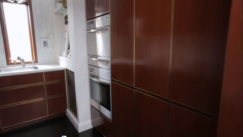
For these projects, I always start with the plans and elevations. We laid out the major appliances and we wanted to be able to have two people work comfortably side-by-side. My husband and I, we wanted to have clean open surfaces. So with that in mind, we had on one side, all the vertical elements like the fridge, the pullout pantry, and the wall ovens. Thereby giving a vertical line to one side, but also then giving ample counter space opposite and a more horizontal point-of-view.
Luxury Kitchen Cabinets Brands
The Europeans design a smaller footprint for their appliances. So that was perfect they weren’t going to overwhelm our small luxury kitchen design. We also hid them behind panels, so that the fridge, the kitchen pantry cabinet, the dishwasher, all are invisible. Maximized and had the upper cabinets on the opposite side of the tall elements. We ran the cabinets to the underside of the ceiling which gave visually a very beautiful line but also gave us the easy storage solutions.

Cherry, Brass, and Marble
The three materials in the luxury kitchen design are cherry, lacquered brass, and marble. There’s a small grain with cherry, also that there’s a silky kind of quality to it, which has a furniture finish to it. We had the finish and rubbed which also gave the hand of the craftsman. Then to complement this, we combine that with on lacquered brass. We framed each cherry cabinet with the brass.
Kind of My Nature
The marble was selected because I love the drama that’s created because there’s a big contrast between the dark cabinets and the light marble. So immediately a big drama in our luxury kitchen design. I couldn’t have a space without some display, I think that’s kind of been my nature. There was one special area by the window which I allowed to have open storage and that was an opportunity for me for displaying my artwork, vintage objects that I’ve collected, and family glassware that I wanted to see in a daily basis.
Story of Venice
There’s a great story about the light fixture it’s from Venice. On one trip a friend of ours told us about a lady outside of Venice who had a lighting warehouse. So we got a train out to see her, and I was in heaven. Honestly, it was like a lighting graveyard because there was like pictures in this huge field. We brought this piece back and had our wonderful electrician Tony assemble it for us.

Luxury Modern Kitchen Design
I think it’s really important for people to have things in their luxury kitchen design is that have a story behind them have meaning. It’s much different than buying something from a catalog or from a store when you’ve got a story behind it. For any space but especially for small space, you can never plan too much. One thing that we did which might be a little bit quirky and that is that once we finish the plans and elevations, we mock this renovate kitchen up full-scale and cardboard.
It may seem a little bit overkill but it really allowed us to walk through scenarios like bringing home lots of groceries, making breakfast together, and really kind of sealed how functional the luxury kitchen design was going to be. I happily discovered after we designed this that I think that this kitchen is more functional than our previous kitchen which was probably four times the size.
Join Our Community
Join our Facebook Page and Group. This information is not associated with Nate Berkus nor Jeremiah Brent. Feel free to subscribe. If you do ever make this do tell us in the comments below how was your experience?


