
Discover Nate Berkus go-to paint colors and how they can transform your space with its subtle yet impactful charm. Nate Berkus, a renowned name in the world of interior design, often faces a common misconception: people believe he doesn’t appreciate color. However, Berkus passionately dispels this myth.
Nate Berkus Go-to Paint Colors
The celebrated interior designer known for his timeless and sophisticated designs, is often asked about his favorite paint colors. These go-to shades have been staples in his design projects, adding warmth, elegance, and character to spaces of all kinds. For those looking to bring a touch of Berkus’ signature style into their homes, here’s a look at his favorite paint colors, as shared by the designer himself through different social media posts.
Benjamin Moore
Berkus frequently turns to Benjamin Moore paints, a trusted brand known for its quality and wide range of hues. Here are the four colors that top his list:
- Alabaster
A soft, off-white shade, Alabaster is perfect for creating a warm, welcoming atmosphere. It offers a subtle brightness without feeling too stark, making it ideal for any room that needs a light and airy touch. - Swiss Coffee
Another versatile off-white, Swiss Coffee is known for its creamy undertones. This shade is slightly warmer than Alabaster, giving it a cozy feel that works well in both modern and traditional settings. It’s a great option for walls, trim, and even cabinetry. - Smokey Taupe
Smokey Taupe is a beautiful neutral with a hint of warmth, perfect for adding depth to a room without overwhelming it. This color works wonderfully in living rooms and bedrooms, offering a grounded yet sophisticated look. - Snowfall White
As the name suggests, Snowfall White is a crisp, clean white with cool undertones. It’s an excellent choice for spaces that crave a modern and fresh vibe. It pairs well with both bold accents and soft neutrals.
Portola Paints
In addition to Benjamin Moore, Berkus is a fan of Portola Paints, a boutique paint company known for its distinctive, high-quality finishes. Two of his favorites from this brand include:
- Saint Sauvant
This muted shade is a subtle, sophisticated color that adds a calming effect to any room. Its understated elegance makes it perfect for spaces where you want a touch of refinement without overwhelming the senses. - Lisbon
Described by Berkus as a “green-grey,” Lisbon is a historic-looking hue that adds character and depth to a space. Its slightly aged, earthy tone evokes a sense of heritage and pairs beautifully with both modern and vintage decor. Berkus notes that this shade is used often in his projects, as it brings a sense of balance and timelessness.
Favorite Go-To Color
His design philosophy doesn’t revolve around vibrant and bright hues. Instead, Berkus is drawn to colors that are softer, deeper, and moodier – hues that can transform a space without overwhelming it.
He affirms, “Why does everybody think I don’t like color? I do like color, and I am going to give you a color right now that is one of my all-time favorites.”
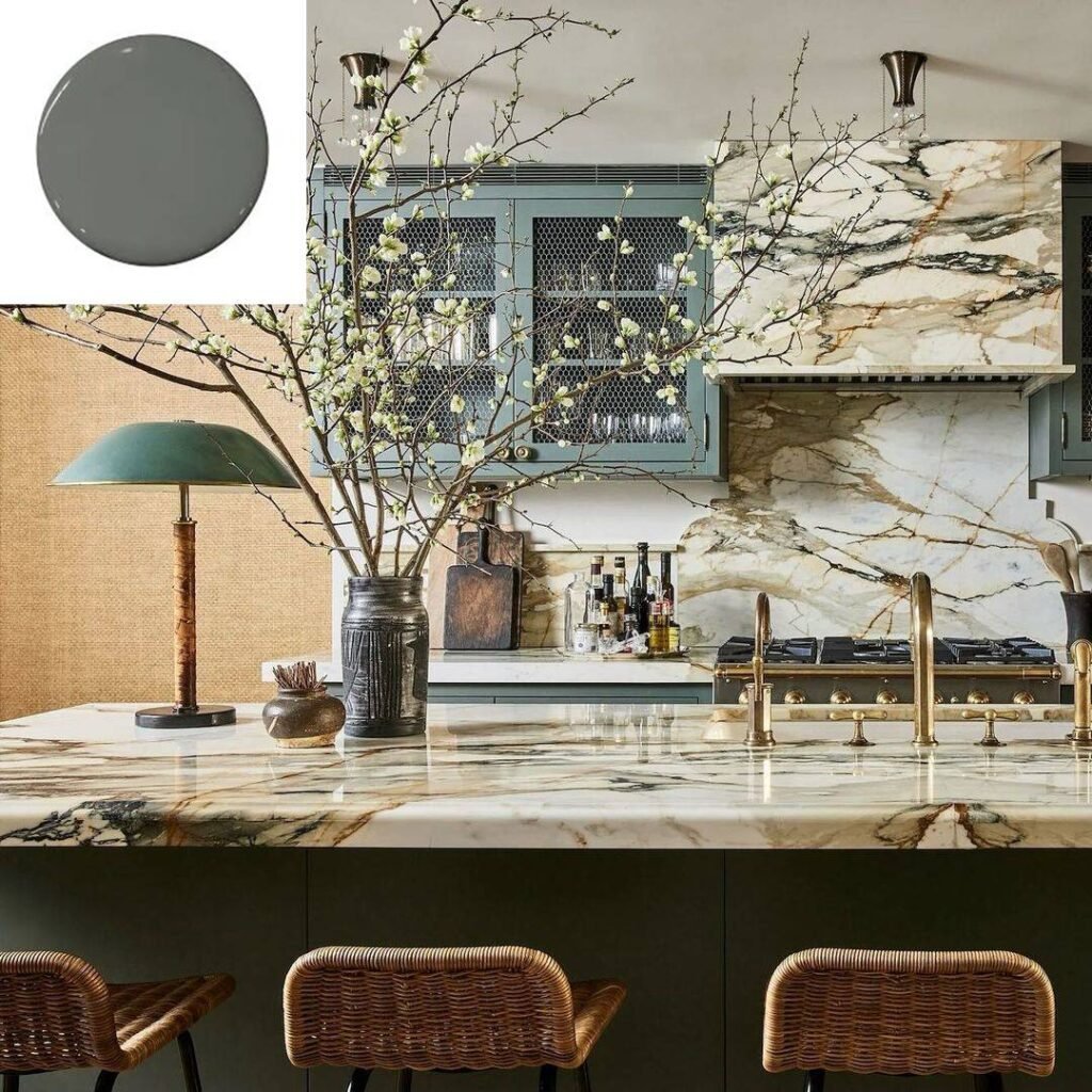
Among the spectrum of colors, one that stands out for Berkus is ‘Nitty Gritty’ by Portola Paints. This muddy green shade has become a staple in his design palette. Berkus elaborates on a social media post
“For me, regardless of what anyone else says, the color of the moment is ‘Nitty Gritty’ by Portola Paints. We used it in our kitchen on Charles Street in New York City. I am still using it for clients; it’s kind of a go-to.”
This particular shade resonates with Berkus due to its elevated and understated elegance. It’s a hue that doesn’t scream for attention but subtly enhances the ambiance of any space.
Impact of Color in Interior Design
Color plays a pivotal role in interior design, influencing the mood, perception, and functionality of a space. It can make a room feel larger or cozier, energizing, or calming, depending on the chosen hue and its application. Berkus’ preference for more muted tones like ‘Nitty Gritty’ showcases how even subtle colors can have a profound impact. Such hues can create a sophisticated and timeless look, making a space feel both welcoming and refined. Nate Berkus go-to paint colors are perfect for creating a serene and elevated atmosphere in any room.
Role of Color in Interior Design
Color isn’t just about aesthetics; it’s a fundamental element that affects the overall experience of a space. It interacts with light, furniture, and decor to shape the environment. In interior design, the right color can highlight architectural features, create focal points, and even influence emotions. Berkus’ selection of ‘Nitty Gritty’ underscores his understanding of how a well-chosen color can elevate a room’s design. This particular shade of green has a grounding effect, offering a sense of stability and calm while still being versatile enough to complement various styles and furnishings.
How to Choose the Right Color for Your Space
Choosing the right color for a space can be a daunting task, but it’s essential for achieving the desired ambiance. Below are some tips inspired by Berkus’ approach to selecting colors. You can also read Nate Berkus guide on Vintage Items on design choices.
Consider the Mood: Think about how you want the space to feel. Colors can evoke different emotions; for instance, blues and greens are calming, while reds and yellows are energizing.
Assess the Lighting: Natural and artificial lighting can dramatically alter how a color looks in a space. Test paint samples at different times of the day to see how they change with the light.
Harmonize with Existing Elements: Look at the colors of your furniture, flooring, and decor. Choose a color that complements these elements rather than clashes with them.
Start Small: If you’re unsure about a color, start with a smaller area, like an accent wall or a piece of furniture. This allows you to see how the color works in your space without committing to a full room.
Trust Your Instincts: Ultimately, the best color for your space is one that you love and feel comfortable with. Don’t be swayed too much by trends; choose a color that resonates with you personally.
Why These Colors?
Nate Berkus’ choice of paint colors reflects his design philosophy: to create spaces that feel both personal and timeless. These shades allow for versatility, whether you’re designing a light, airy space or something more moody and grounded. Each of his favorite colors works beautifully as a backdrop for different textures, materials, and decor, ensuring that your home feels curated and cohesive.
Conclusion
If you’re looking to revamp your home with a timeless and sophisticated hue, consider Nate Berkus go-to paint colors for a touch of understated elegance. Incorporating these colors into your home is a surefire way to channel Nate Berkus’ timeless, elegant style. Whether you’re painting an entire room or just adding accents, these shades will elevate any space with their enduring appeal.


Pingback: Nate Berkus Father's Day Gift Ideas for All Dads - Nate and Jeremiah Fans
Hey people!!!!!
Good mood and good luck to everyone!!!!!