[toc]
Inspired by the pre-war architecture in New York City, designer Grace Castaneda created traditional interior design living room influenced by 1930s. Read how about how she made that all possible.
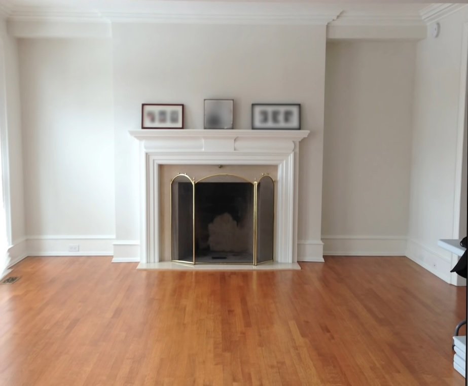
What was really clear to me was the bones of the house were beautiful. It has really high vaulted ceilings, well-proportioned fireplace for the room, lovely mid-tone oak floors. They did harken back to a pre-war architecture.
Traditional Interior Design
So this client spent some time in New York City. She was very influenced by all the art with air and pre-war architecture of that city. She really wanted that style and feel in this house. The bones of this house were spot-on for creating something of that era.

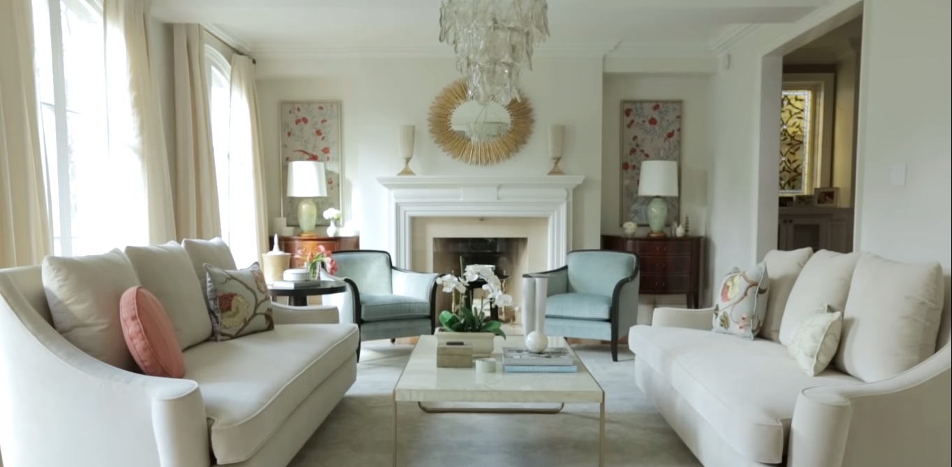
The homeowner wanted people to come into this house and feel relaxed, at the same time very elegant. Something which gives a feel like Mediterranean interior design. So we kept the palette very very light soft greens, light tones of corals and pinks. I wouldn’t say that it’s a room that doesn’t have color but all the tones are very very needed.

Traditional Interior Design History
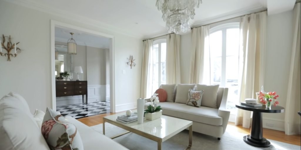
The starting point was choosing the right sofa, and we found a style that had a nod to the pre-war style. It’s very pared back but it has a beautiful scrolled arm. It is very comfortable and elegant enough for this room. We then found the armchairs which have a beautiful flared show wood arm. It’s something that you might find in the 1930s but again simple and modern enough for today.
Interior Design Styles
If we talk about traditional interior design materials, the side table has a really beautiful stacked base. It progresses almost like a tower. My favorite piece in the room is the coffee table. It’s on a solid brass architectural base. The top is sort of a painted geo pattern. It brings a little bit of glamour into the room and is natural at the same time.

Silk Painted Panels
The floral motif in the room actually started with this beautiful fabric which is from cravat. There was a huge opportunity to implement a modern traditional interior design art in this room and I felt that on either side flanking the fireplace, it would be lovely to bring the florals up onto the wall as art. So we found these beautiful silk painted panels.
Large Mirror
The very large dresser in the foyer was here. It’s a spectacular flamed mahogany piece. It was perfect for the style that we were going for. So we built around tha.t We found a spectacular Thomas pheasant chandelier which is simple. It’s got hundreds of cut glass tile in it but it really is restrained and architectural at the same time. There was a very large mirror. A wonderful antique piece that has a bit of a Machine age quality to it.

Modern and Practical
When you’re working within a particular era or style, it’s really important to strike a balance so that it doesn’t feel like a theme room when you walk into it. The key to that for me is a restraint for traditional interior design. It’s choosing the right pieces that are a nod to that particular style but then choosing fabrics that are modern and practical.
In pulling back a little bit on the architectural design. If it’s an ornate style that you’re working within cleaning up the lines just a little bit. So there are hints of pre-war in this room but they don’t leap out at you. I think that is just a result of striking the right balance.
Feedback
Join our Facebook Page and Group. This information is not associated with Nate Berkus nor Jeremiah Brent. Feel free to subscribe. If you do ever make this do tell us in the comments below how was your experience?


