[toc]
Designer Sandra Mendes did an inefficient kitchen remodeling and dining room into an open-concept, eat-in space, with a generous seating banquette that incorporates storage. Read about how she made smart solutions such as appliance garages to keep this kitchen looking spacious and organized.
Kitchen Remodeling
Hi, I’m Sandra Mendez, a designer. We’ve just recently finished a great kitchen Reno for a young family here in Toronto. So here is my renovation story.

What to Consider When Remodeling a Kitchen
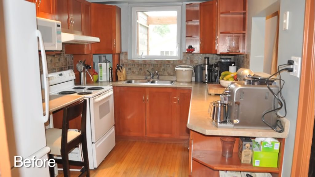
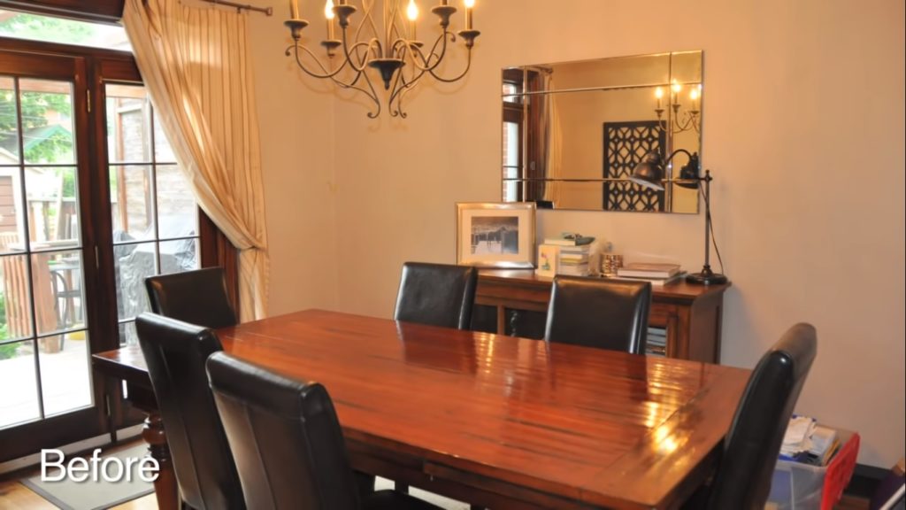
When I first saw the space, it was actually quite frightening. It was extremely small. There was a wall in between. The original kitchen in the original dining room. So the kitchen was u-shaped it was extremely cramped very inefficient. There was hardly any storage space. When the client came to the showroom, we went through all of the available options here before coming up with a perfect solution for her.

Kitchen Remodel Ideas Before and After
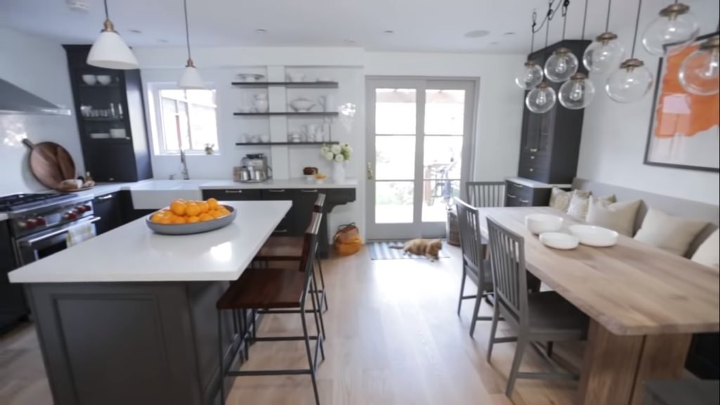
Part of the original plan was to take down the dividing wall between the two spaces. It’s great that they did that because it opened up the space completely. The kitchen remodeling is an l-shaped kitchen and pretty much the appliances have stayed in the same location because there weren’t too many options to relocate them. So on the left side, we do have a built-in refrigerator. It’s quite large and tall.
Appliances Garage
Adjacent to that, we have an appliance lift garage. So it’s a perfect spot to hide small appliances. There’s also a glass cabinet above to display certain items. Continuing along, we have the range and we also have a hood fan centered over the range. Moving around the corner, we had space to add in a second appliance garage and a second display cabinet. Adjacent to that, we have an apron-style farm sink, which leads well to the transitional look.

The Finishes
When the client came here to choose her finishes. She knew that she liked the darker finish. She really liked the Fairfax store in an anthracite finish, which is the very dark gray which is one of the many finishes available here.
Shelves, Tiles, and Countertop
One of the interesting features of this kitchen remodeling is that there is not a lot of closed wall cabinet storage. Instead what they’ve opted to do is to incorporate some open floating shelves. We’ve actually cut the shelves around one of the columns in the luxury kitchen design that could not be removed but it worked well in this space.
The tiles in the countertop, those followed after she selected the kitchen pantry cabinet. The countertop is white Caesar stone. So it’s quite neutral and it goes well with many color palettes. The backsplash tile is also very neutral in the whites off whites.
Dining Room
Moving along towards the opposite side which was the original dining room, we’ve managed to incorporate a buffet, which is a perfect spot to store dishes, glassware, tableware. It also has some decorative details on the buffet. Adjacent to that, we now have banquette seating which worked out perfectly because they’ve positioned a large harvest table in the space. She can sit many people at this table. Underneath the seating we have drawers which is a perfect spot for storage. For hiding those items that are not often used.

Transitional Kitchen Remodeling for Me
I would describe this kitchen remodeling as being a transitional kitchen decor. Part of the reason is that the hardware is traditional. The crown moldings are traditional. Some of the other elements such as the door style are very clean lines. So it leads more towards a transitional style.
Happy Clients Make me Happy
I really enjoyed working with this client. It was a great space to work with. It was a little demanding because there was a lot to fit within the space. But in the end, I’m really happy with how the job turned out. Especially since I got to see what the space looked like before the kitchen remodeling. So the difference is quite amazing.
Feedback
Did you like it? Let us know in the comments section below. Or join our Facebook Page and Group.
This information is not associated with Nate Berkus nor Jeremiah Brent. Feel free to subscribe.


The example you gave of a kitchen that has an adjacent dining room setup that can also be a buffet really caught my eye. As someone who constantly has their relatives over for dinner parties, getting meals ready for that many people can definitely be stressful especially when it gets crowded. This design of the kitchen you showed looks like a great way to prevent these hectic dinners, so I’ll find a kitchen remodeling contractor and have them help me get something similar to this.